About
Senior product designer who came up through graphic design and art direction,
and still designs like it.
I started as a graphic designer, then moved into art direction — running branding, identity and campaign work across advertising and editorial for a range of well-known consumer brands.
That grew into visual design and art direction for digital, where an advertising background in craft and concept started meeting UI and product thinking. From around 2019 it shifted fully into product design — the discipline I've worked in since, across fintech, travel, retail, energy and enterprise tools.
I work best close to the people building the thing: accurate research up front, strong aesthetics throughout, and a clear view of what can realistically ship.
WORKED WITH


Focus
Recent engagements
Connect
Open to conversations with
01Teams with a genuinely complicated product and a low tolerance for decoration.
02Founders at 0 → 1 who need brand and product designed as one thing.
03In-house teams that need a senior pair of hands on a system, not a rebrand.
04Open to the right permanent senior or staff product design role too.
Overview
Builder Tracker is an internal project management platform with Task Management and Time-Tracking tools for project execution.
Task management:
Categorization of tasks in different verticals based on the project progress.
Integrated with Code Repository:
It is seamlessly integrated with Git and all development related user stories
have a Code Commit ID. Time Tracking effort estimation and tracking hours while delivering a task.
Notifications
Notifications are grouped by what they ask of you — action, mention, or update — rather than by chronology alone.
Filters
A multi-category filter panel — Phases, Story Type, Owner, Label, and Feature — that narrows the board down to exactly what someone needs
to see.
Filters stack (the example shows 5 active at once) and clear in one click, so a Scrum lead can isolate, say, just the open "Full Build UI" stories in seconds.
Mega Panel /
Quick Actions
A right-click quick-actions menu on any story card — Approve, Reject, Edit Labels, Change Members, Copy Story — plus inline dropdowns to reassign Story Type and Story Phase without opening the full story.
Built so the most common status changes never require a page navigation.
Rate Card
The project-level dashboard: total stories broken down by status and priority, total tracked vs. approved hours, and a per-member rate card showing hourly rate, tracked/approved hours, and qualitative delivery ratings (Ownership, Responsiveness, Communication).
So leads can approve directly from the row.grouped by what they ask of you — action, mention, or update — rather than by chronology alone.
Create Stories /
Sub Tasks
The story creation and edit modal — title, parent feature, description, labels, and blockers referenced by @story or @user — with quick actions to duplicate the story, create a subtask,
or delete it.
Story Type and Status are color-coded dropdowns (Unstarted through Accepted/Rejected)
so state is readable at a glance back on the board.


User Dashboard
A personal dashboard for each team member — total stories by status, the projects they're active on with estimated/
logged/approved time per project, a running activity feed, and a weekly timesheet.
Built so both the individual and their lead can see workload and hours without digging through the board.

Overview
I designed and shaped the UX/UI for a new onboarding flow for Otrium, capturing customer style and brand preferences up front so the platform could surface relevant products immediately — designed consistently across web, iOS, and Android.
Otrium's catalogue spans hundreds of outlet brands; without a clear signal of what a shopper actually wants, browsing becomes noise.
We want to know the following of the user:
Favorite type of brands / Brand department. Preferred High-level clothing categories. Style preferences / What do you shop the most (Dresses, jeans, Shoes, Shirts etc.)
Wireframing
the concept
Sign-up opens with three low-friction options — Facebook, Google, or email — with the value prop stated upfront.

At least one required — Womenswear, Menswear, Kidswear, or any mix — and the stores picked set the category options shown next.

Categories expand inline per store as multi-select toggles, letting shoppers narrow down in one screen.

Popular brands surface first in a recognizable grid — tap to shortlist favorites, no searching required.

The grid extends via “Load more” in place, so widening the search costs just a scroll.

Selections roll into one summary with two exits: browse now, or go deeper with four more refinement questions.

First of four optional questions — a simple multi-select of core colours.

Style captured as a fast binary choice, Casual vs. Elegant, instead of an abstract label.

Same multi-select logic applied to patterns — plain, print, stripes, animal print, checker.

Sizes captured per category (dresses, tops, shirts, accessories) in EU sizing, then mirrored for a second wardrobe.

Designing the concept
{{ otDesignText }}Overview
As a Senior Designer on the Canon Pro project, I led the Art Direction and UI redesign of Canon's professional cinema and broadcast camera site, translating the precision and craftsmanship of Canon's hardware into a digital experience built for working cinematographers, DPs, and camera rental buyers.
The result repositioned Canon Pro from a standard product-marketing site into the reference platform its professional audience now treats as a "go-to" resource.
The challenge wasn't just a visual refresh — it was making a highly technical, considered purchase feel as premium as the hardware itself.
Homepage
A dark, image-led homepage that opens on a single feature story, followed by an “Inspiring Content” grid and product news.
The photography carries the page; the interface stays out of the way.


Topic Pages
Topics such as Architecture gather stories, interviews and galleries under one theme, in a mixed-size grid that gives each image room.
On mobile the grid collapses into a single editorial column.


Kitbag
Stories end with “What’s in the kitbag” — the cameras, lenses and accessories the photographer used, each linked straight to the product.
Inspiration turns into research without leaving the page.


Mega Navigation
Navigation first switches between Consumer, Pro and Business audiences, then drills into Products, News & Events, Insight and Support.
On mobile each level opens as a full-screen layer with a clear way back.


Overview
Kaluza Flex is Kaluza’s world-leading demand response product. By intelligently charging millions of smart home devices and enabling agile innovation of green propositions, Kaluza Flex mobilizes customers in the energy transition by making decarbonization simple and rewarding.
At the time, Scottish Power was one of the latest companies to use the Kaluza Flex white-label app.
As a Senior Product Designer, I led the UI transformation of Kaluza's white-label demand-response app into a fully Scottish Power–branded product, and built out their own Design System with reusable tokens and components for future features. Alongside the rebrand, I designed the UX and UI for two new features — Urgent Charging and Weekly Schedule.
App Flow
The full journey on one map: onboarding, account linking, connecting a car, a guided tutorial, then the dashboard and every charging state.
Mapping it end to end showed where the white-label flow needed Scottish Power-specific steps.
Connecting your car
{{ spConnectText }}Tutorial
{{ spTText }}Planning charging
{{ spPText }}Urgent Charging
{{ spUText }}Weekly Schedule
{{ spWText }}Account
{{ spAText }}Overview
As a Senior Product Designer, I designed the concept for Air France-KLM's new Commercial Card app, built in partnership with BNP Paribas — spanning flight and ancillary booking, Flying Blue and KLM account management, joint financial management for additional cardholders,
and family-oriented tools like Child Cards and Trip Goals.
This wasn't a single-stakeholder product: it had to satisfy an airline's loyalty and booking ecosystem, a bank's card and compliance requirements, and end users trying to manage shared family finances around travel.
Onboarding
A tabbed application form with fingerprint set up at creation, ending on one screen that confirms the account, credits a welcome bonus, and activates the digital card.

Additional Card Member
Adding a cardholder is a shared, incentivized action — the invitee chooses to merge or keep their miles separate, then the dashboard shows a combined balance with per-holder limits.

Money Pot
A Pot is named, shareable, and target-set from creation, then tracks progress and surfaces trip-related offers.

Child Card &
Trip Goal
Child Card setup leads with what the child gets, and their Trip Goal can be boosted through quizzes or lessons, not just funding.

Trip Details & Expenses
Trips list with key details up front, each opening into four functions, with expenses checkable line by line.

Overview
As a Senior Product Designer within FJORD, I was part of the team that redesigned the Bank of Scotland website and updated its Design System to match a new visual direction — one that had to align with sibling brands Lloyds Bank and Halifax while preserving Bank of Scotland's own identity, across both Hub and Servicing pages on desktop and mobile.
Lloyds Banking Group's multi-brand structure means Bank of Scotland can't diverge too far from Lloyds and Halifax's shared visual system — but it also can't lose the distinct identity that its customers recognize and trust.
ISA
ISA options page, desktop and mobile view.


Car Finance
Car Finance page, desktop and mobile view.


Card interactions
Examples of card interactions, on desktop and mobile.


Overview
As a Senior Product Designer, I led the Art Direction and UI Design for BP's “Keep Advancing,” an educational platform built to bring people into a shared conversation about how to meet the world's growing energy needs while reducing greenhouse gas emissions.
Energy transition is a technical, often politically charged topic — the platform needed to invite genuine debate rather than read as corporate messaging, while still being visually credible enough to host serious discussion.
Home page
The home page on desktop, with its loading state on mobile.

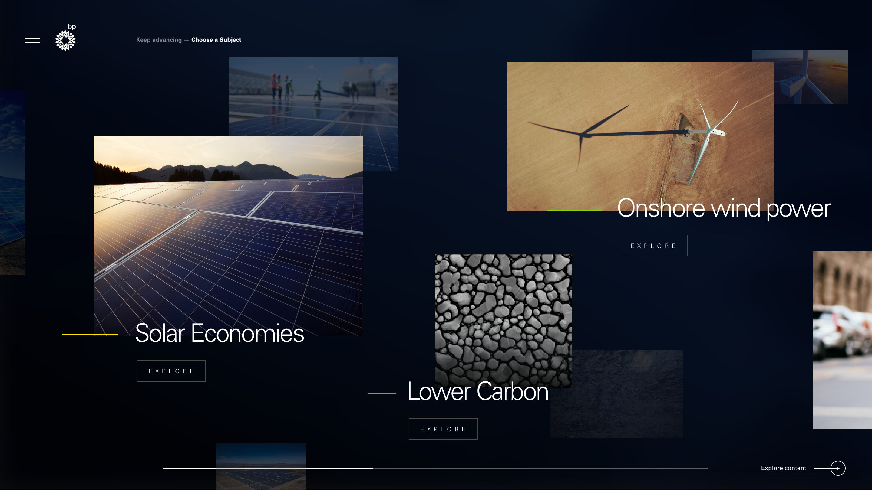
Subjects
The subjects of the energy transition, laid out to explore.

Conversations
The Architecture topic page, where the conversation happens.

Menus
Menus on the Architecture topic page, on desktop and mobile.

Overview
One product, two connected pieces of work.
Optic is Inchcape's operating platform for port agency work. The Operator Dashboard is the screen every port call passes through. Quote to Cash runs the commercial life of a port call underneath it — from accepting a vessel appointment through to a settled account.
My job wasn't to invent these flows. It was to sit with the people running them, find where the existing design broke down under real use, and rebuild the screens and their behaviour so both the end users and the engineers building it could trust what they were looking at.
These two case studies are part of a much larger body of work I delivered across Optic during my three-year contract with Inchcape as a Senior Product Designer.
Operator Dashboard
The screen every port call passes through. Nine discovery scenarios, four characters — and how each need became a piece of UI.
Before any screen: three questions
What to track, by whom, and when.
What kind of data users want to track, and which scenarios the characters are involved in.
The typologies of characters active in this scenario, and the data each typology of user needs.
Each phase for each user we track, and how users interact with each other along the dashboard.
Each scenario, broken down the same way
Who, what they track, what they do, and why.
All nine pass through the dashboard
So it has to carry status, tasks and notifications at once.
An overview of every open vessel
→ Four status columns.
En Route, Arrived, Alongside, Sailed — one column per port-call status.
Each column header carries its own count.
Card view is the selected view in the header.
“Wants to see an Overview of Current, Upcoming, Live and Sailed Vessels that are Open, along with LIVE enquiries”

Told about changes without searching for them
→ Task count in the header, drawer one click away.
“Tasks (3 Overdue)” sits in the header on every screen.
Opening it slides “Tasks to complete” in beside the board.
The jobs stay in view while tasks are worked through.
“Wants to be notified actively about any change of the opened job statuses”
Every notification became a one-line task
→ Brief description, vessel, job number.
Urgent work stands out from routine work
→ Amber action tasks.
Action tasks get an amber edge and an amber pill — here, “Invoice overdue”.
Common tasks keep the grey pill.
Pressed, the action pill turns blue.
“NOTIFICATION: A Urgent Task needs to be followed up with an Appointer for Approval of a revised DA.”
One card, two ways in
→ The card opens the job; the task pill opens tasks.
Pressing the card opens the job overview (first job shown in the tab).
Pressing the task button opens the task panel.
Default, hover and pressed are specified for both.
“Clicks through the Job Grid and Opens The Job”
Finding the right job on a full board
→ Filters in a sidebar.
Port, Vessel, Job Status and Port Call Status in one sidebar.
Applied filters become chips, with Clear Filters beside them.
No results says how to recover.
“Filters jobs in Draft Status”


Still clear at volume
→ Card view and list view.
Card view groups jobs by status; list view gives one row per job.
Same status tags and colour edges in both.
The colour spec notes status colour is “best used for multiple vessels 10+ and list view.”
“Have a clear vision of the Job statuses”
Checked against the build
Each difference pinned on the screenshot.
Seven needs, seven pieces of UI
From the In Discovery boards to the Design page.
A few rules I kept coming back to
Wherever the old design used a single status word, we asked what someone actually needed to know to act — usually that meant showing the state as structure, not prose.
Every gate — sanctions, mandatory checks, DA advancement — blocks the next action visibly, with a reason, instead of failing quietly downstream.
Cloning a job saves re-keying, but still drops the agent into a review step. Speed and a second look weren't treated as opposites.
Quote to Cash
The commercial flow underneath Services — from accepting a vessel appointment through to a settled account.
One job, five stages
A port call starts as a nomination and ends as money settled.
Between those two points it passes through an agent, a hub reviewer,
a compliance check, a vendor and a finance system — and at every handoff, someone needs the screen in front of them to say clearly what state the job
is in and what they're allowed to do next.
From what people told us, not a blank page
Interview synthesis → UI/UX redesign → developer-facing annotation specs.
The screens already existed before I got involved — the Services module had been shipping for a while. My part started with the research we'd gathered from user interviews: agents, hub reviewers and finance staff talking through where the current design slowed them down, confused them, or made them double-check things it should have told them outright.
From those findings I re-thought the UI and the underlying behaviour of each section — not just how it looked, but what it should do at each state, what it should block, and what it should surface without being asked. Then I annotated every section so engineering could implement it without guessing.
What kept coming up, and what we did about it
Three recurring problems, each paired with the redesign it led to.
Nobody could tell, at a glance, why a job was stuck at Approval Pending, or trust that a sanctions screen had actually run before someone hit Accept Job.
A gate that can't be talked around: the appointment is screened before Accept Job unlocks, with the result shown as one of three explicit states — clear, possible match, or detected.
When a Disbursement Account got questioned later, agents and hub reviewers had no shared record of who changed what, or when — just the current status.
A DA History that reads like an audit trail, not a status field: every transition timestamped, with the actor and the role — nobody grading their own homework.
Funding under 100% went out with no record of why — and near-identical jobs on the same vessel meant re-keying the same nomination over and over.
A required justification before a partial funding request can submit, and a Clone Job shortcut that lands the agent back in Job Details to review before continuing.
Create — nothing gets accepted on trust
A five-step wizard turns a vessel nomination into a live job.
An agent can clone a past job -
inside the same port call,or into
a new one - with vessel and port pre-filled, then review before continuing.
 {{ icCreateAnim }}
Quote — partial funding, visible and justified
The agent drafts a Cost Estimate from the port's disbursement schedule.
Each DA line shows its balance and the percentage being requested up front — anything under 100% requires a typed reason before the form will submit.
Bill — every line collected into one account
The Disbursement Account — the invoice the customer actually sees.

Vendor lines invoiced or paid, revenue and margin posted or paid, expense lines expensed — one stray Draft line holds the whole DA back.
A DA's history reads like an audit trail: LPA drafts, Hub verifies, back and forth — nobody grades their own homework.